Boehringer Ingelheim
As an embedded Visual Designer at Boehringer Ingelheim, I support the Jardiance family of brands within our in-house creative studio. I also lend design expertise to the respiratory and animal health sectors as well as develop projects for internal stakeholders.
In this role, I design and maintain various marketing materials for pharmaceutical sales representatives and marketers. These include promotional materials, email campaigns, digital banner ads, brochures (both digital and print), logos, icons, slide decks, event materials, award presentations, packaging design for in-office displays, and design updates for television and online video campaigns.
Below, you will find a selection of projects I have worked on in this role.
Interactive Training Deck
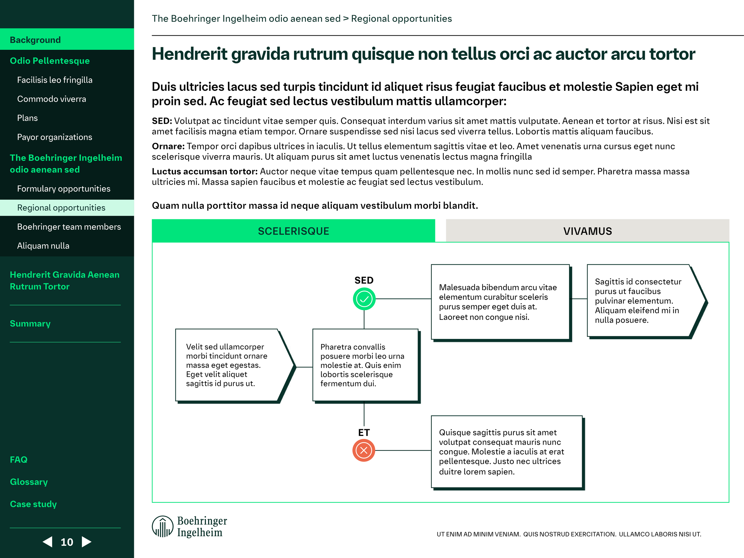
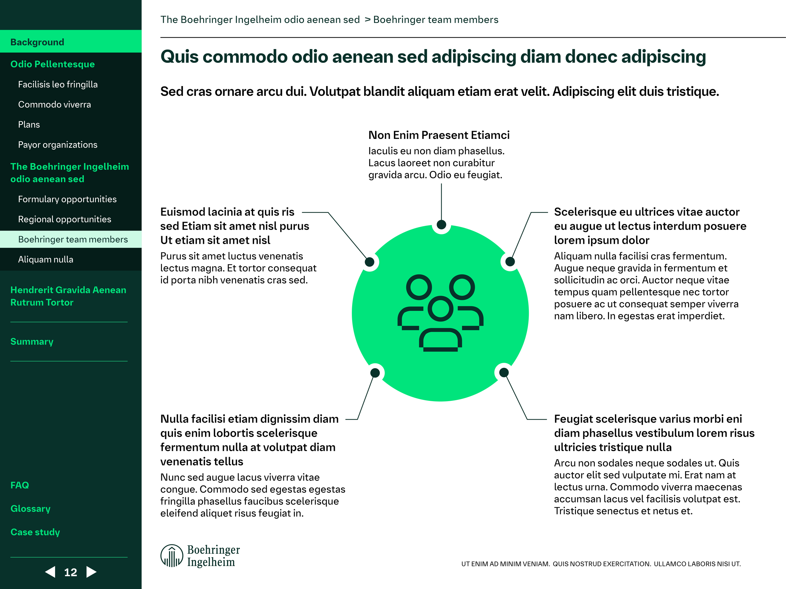
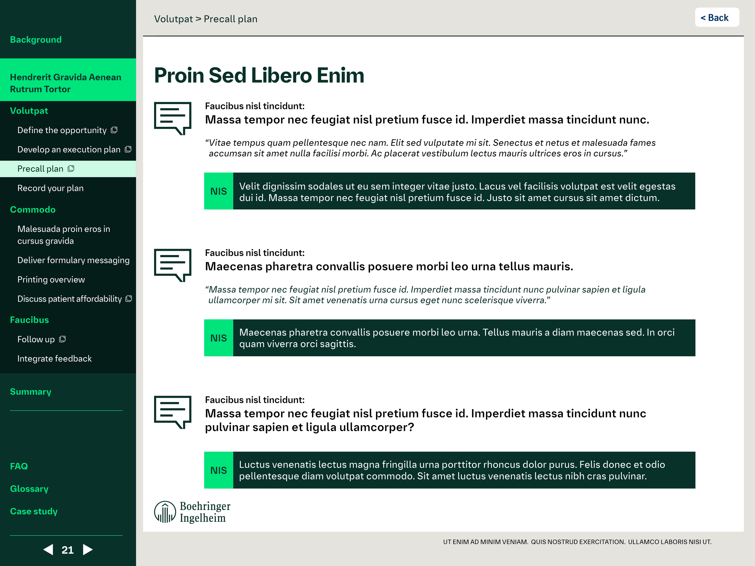
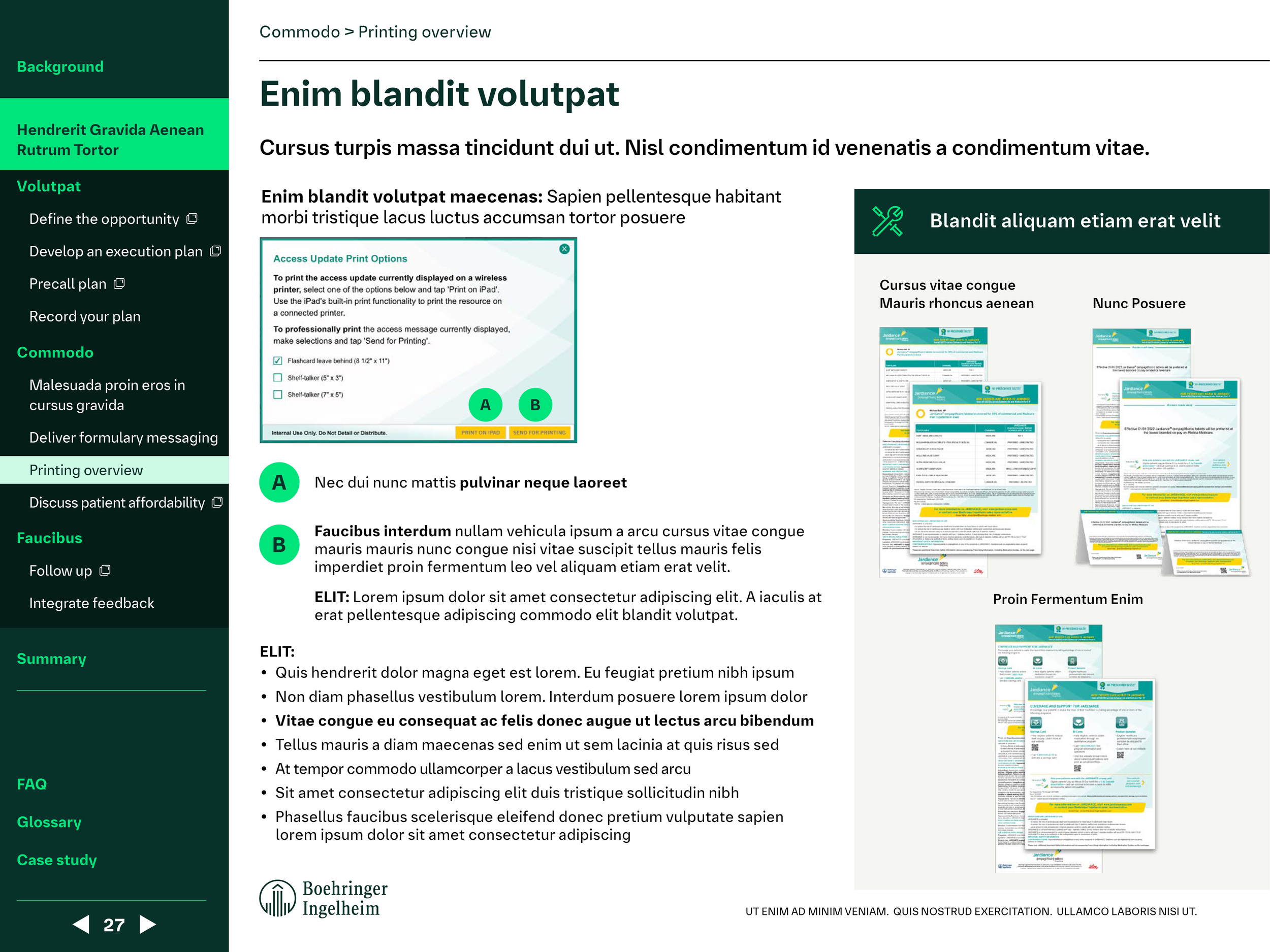
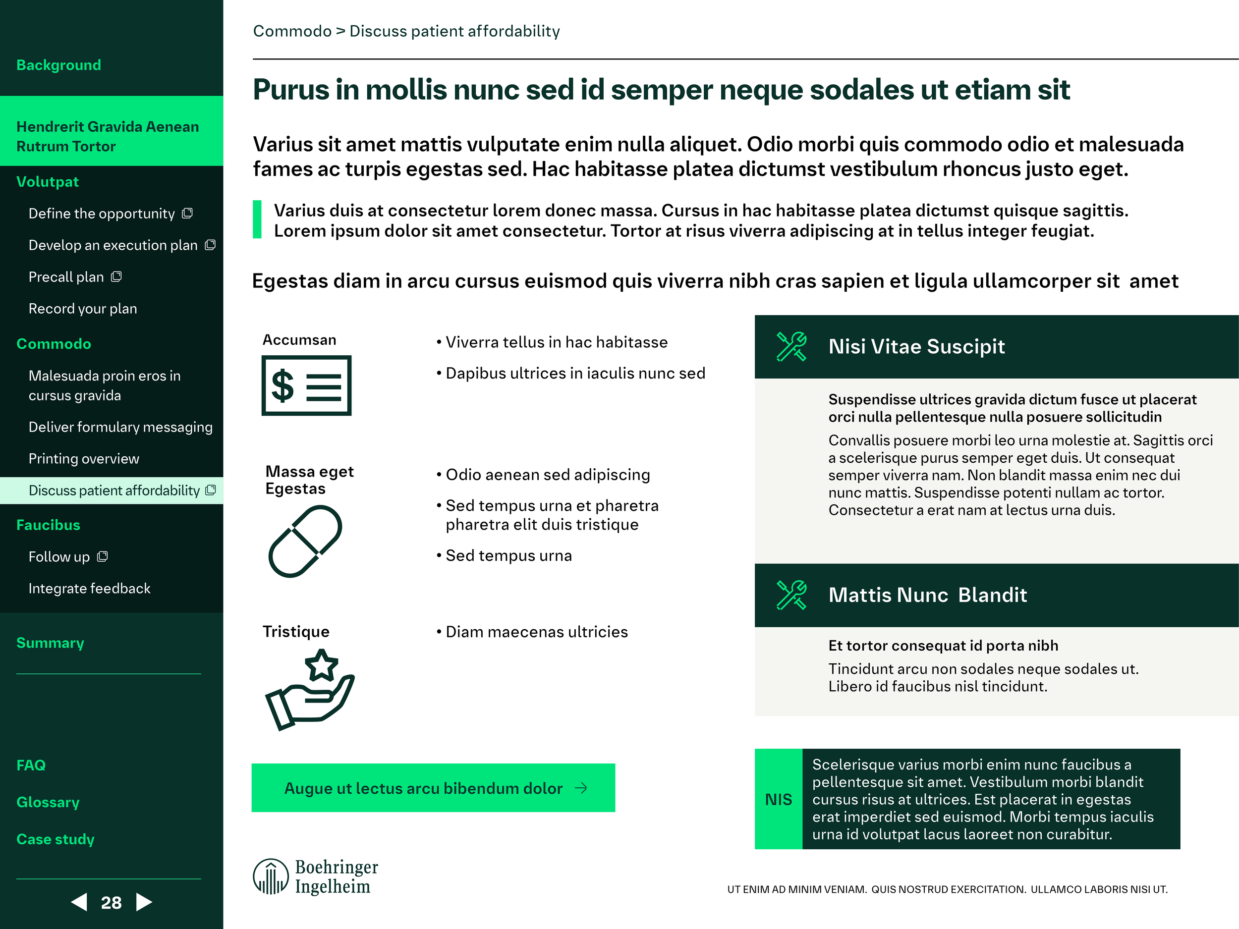
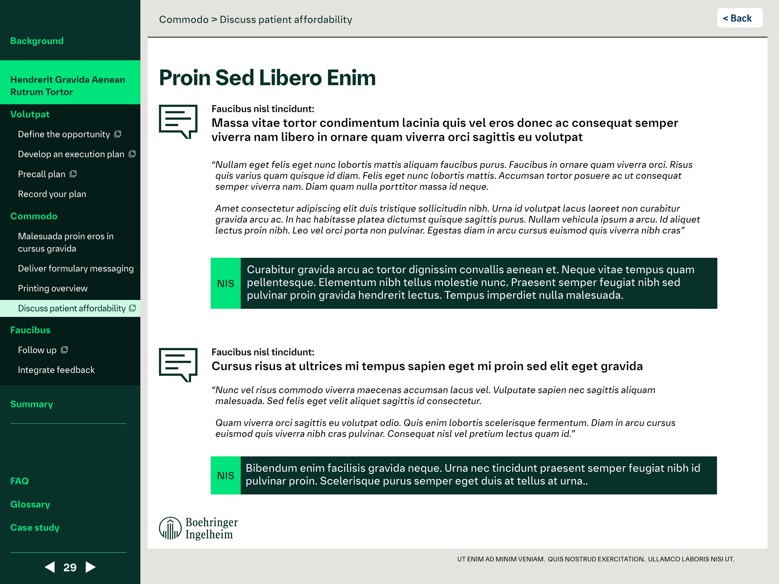
Boehringer Ingelheim recently underwent a comprehensive brand refresh, including new colors, fonts, icons, and a new set of design rules. My team was responsible for refreshing marketing materials to align with these new guidelines. Below is an interactive training slide deck I created as part of this refresh. Due to the confidential nature of the document, the text has been replaced with Lorem Ipsum, and some logos and images have been redacted.
The final PDF is fully interactive and can tested here.
Digital Flashcards
A cornerstone of my work at Boehringer Ingelheim involves designing digital flashcards for pharmaceutical sales representatives. These serve as vital tools for reps when discussing medications with doctors in the field. The challenge lays in crafting visually compelling graphics that effectively conveyed key information to a medically literate audience, all while incorporating the mandatory FDA-required "Important Safety Information" (ISI) section.
The role requires managing frequent, high-volume updates and redesigns of these materials. This honed my ability to prioritize effectively, navigate deadlines efficiently, and maintain consistent brand identity across a diverse range of deliverables.
Email Design
To empower Boehringer Ingelheim's pharma reps, I designed emails for reaching healthcare professionals. These emails prioritized clear messaging for product information, used brand compliant visuals to grab attention, and offered a streamlined format while remaining FDA compliant. Additionally, I was tasked with creating internal email newsletters to inform marketing staff about new initiatives, collateral, and to highlight staff achievements.
Animal Health Tips and Tricks
On occasion, our team was called upon to assist with the Animal Health sector. For this project, we were tasked with creating new graphics representing each of the primary Animal Health species (dogs, cats, chickens, horses, cattle, and pigs).
The graphics were designed to be modular for quick "tips and tricks" shared by the marketing team. My design incorporated a minimalist geometric style, featuring icons of each animal within a speech bubble and a variation without. The final icons were delivered in both the (then-current) Boehringer blue and the Animal Health colors. Additionally, I explored full-body versions of the animal icons and potential final design applications.
The Alliance for Patient Health logo
Boehringer Ingelheim and Eli Lilly formed an alliance to develop and commercialize diabetes treatments, resulting in the creation of the Jardiance family of drugs. Internally, there was a desire to create a new logo to represent this collaboration between two of the world's largest pharmaceutical companies. The logo was initially intended to be used for internal purposes, with the potential for future expansion to a consumer-facing audience.
In my designs, I proposed using purple, a blend of the then-current Boehringer blue and Lilly red. In both variants below, the double Ls of "Alliance" are intertwined, visually representing the collaboration.
Patient Education Tools
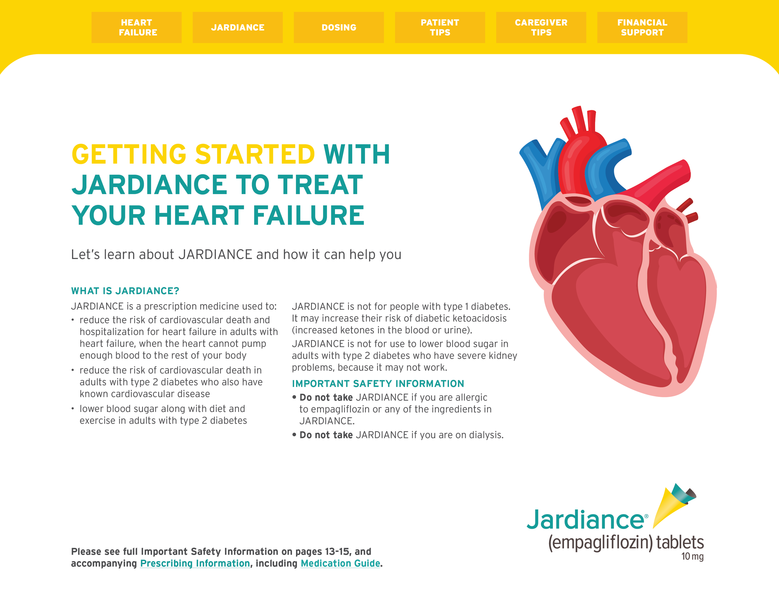
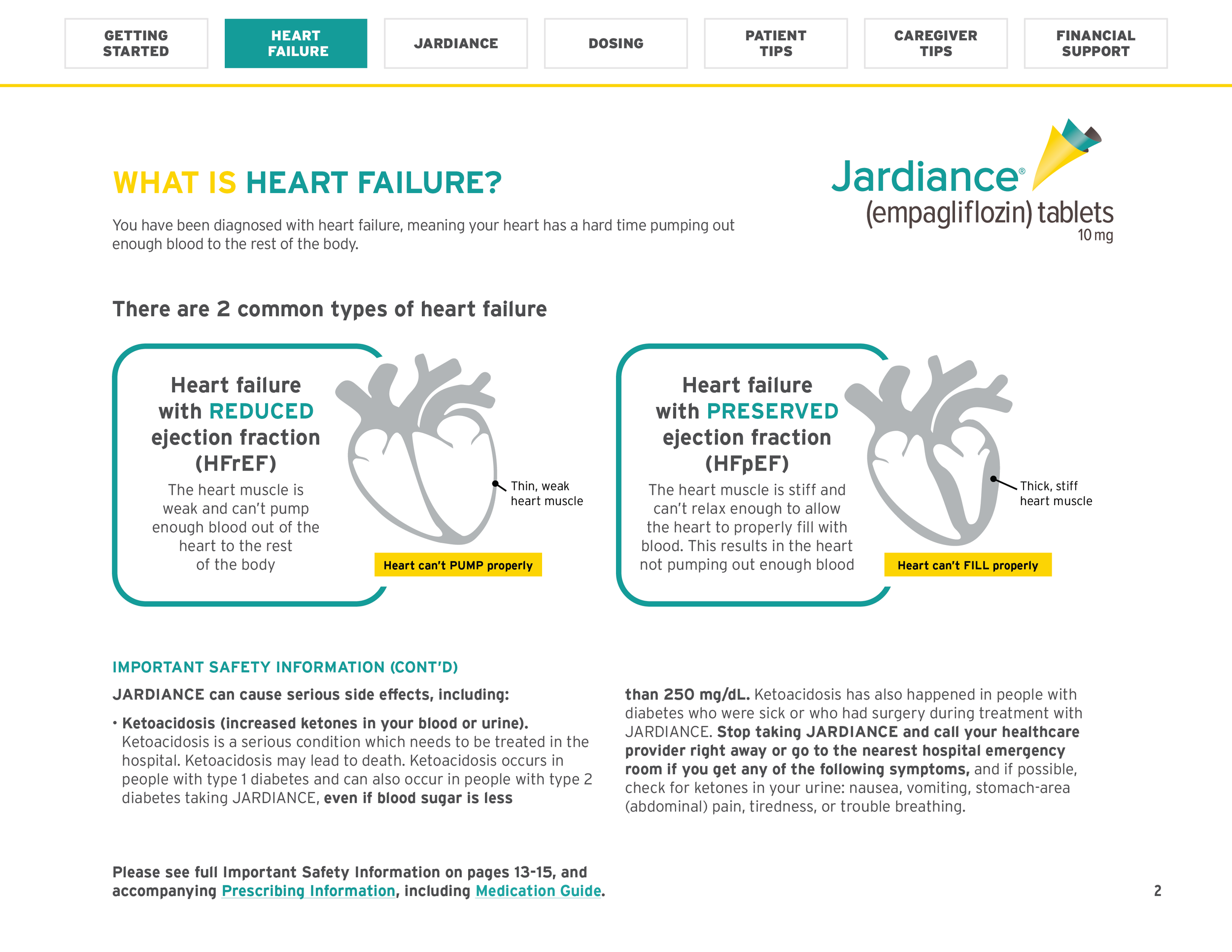
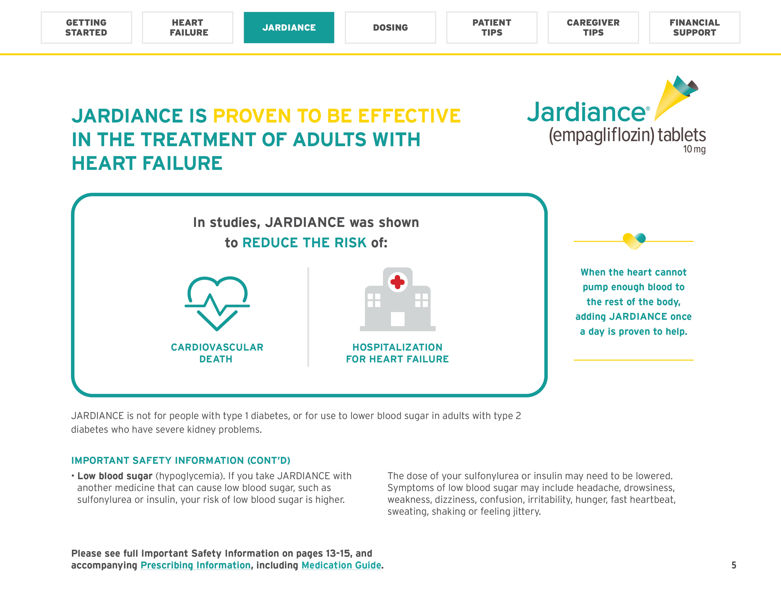
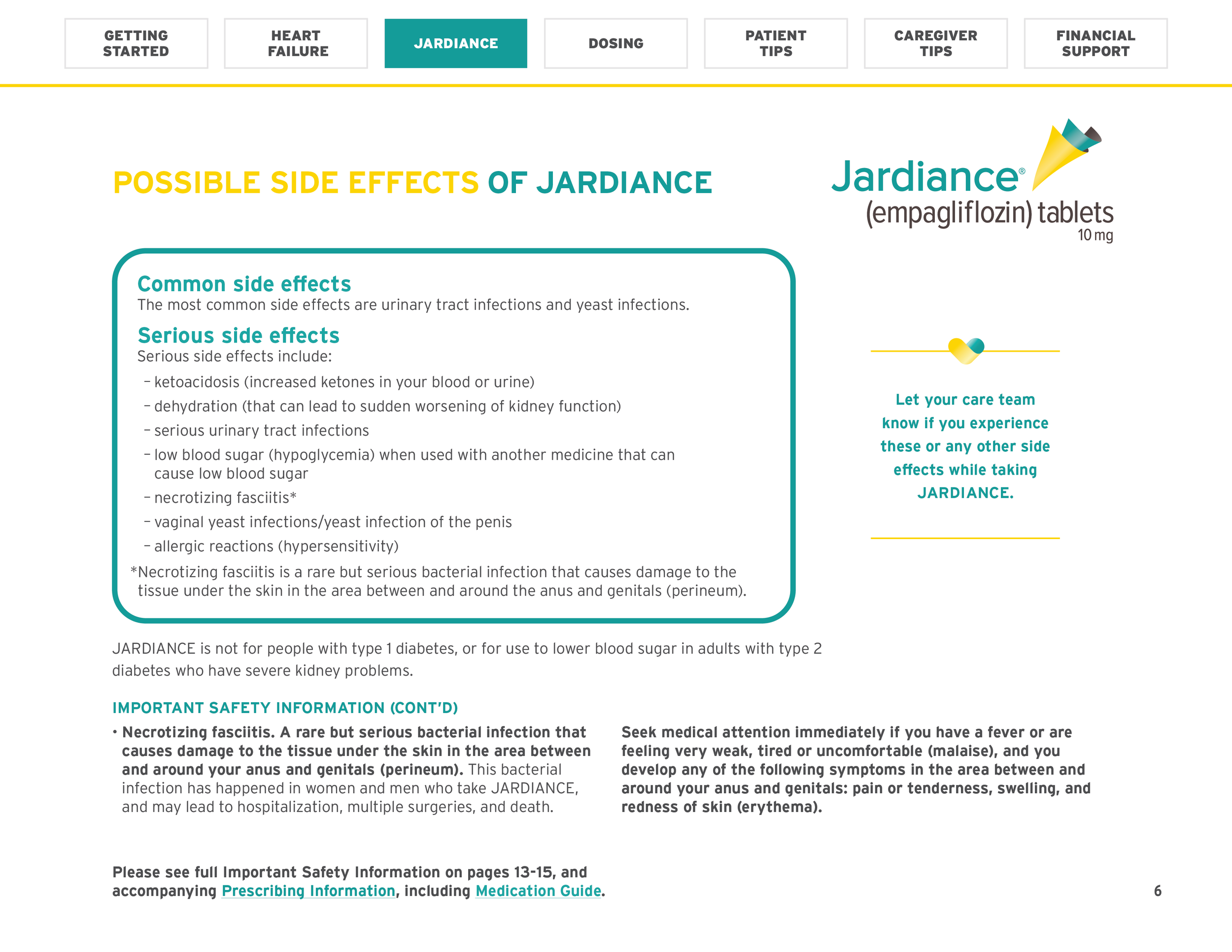
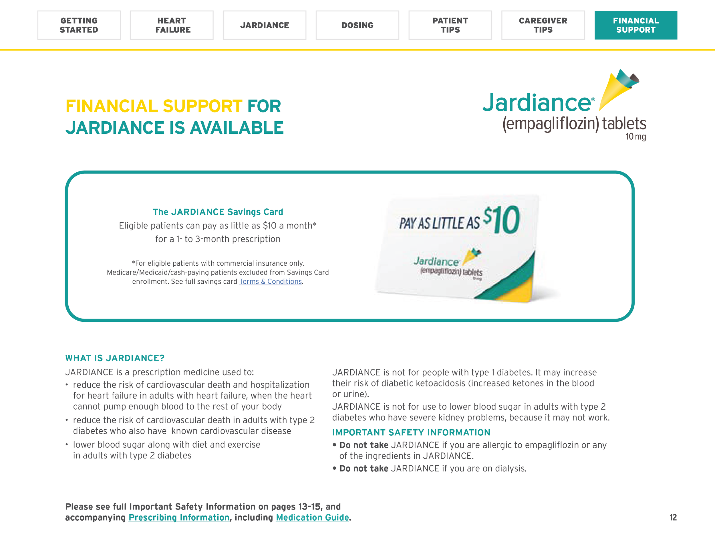
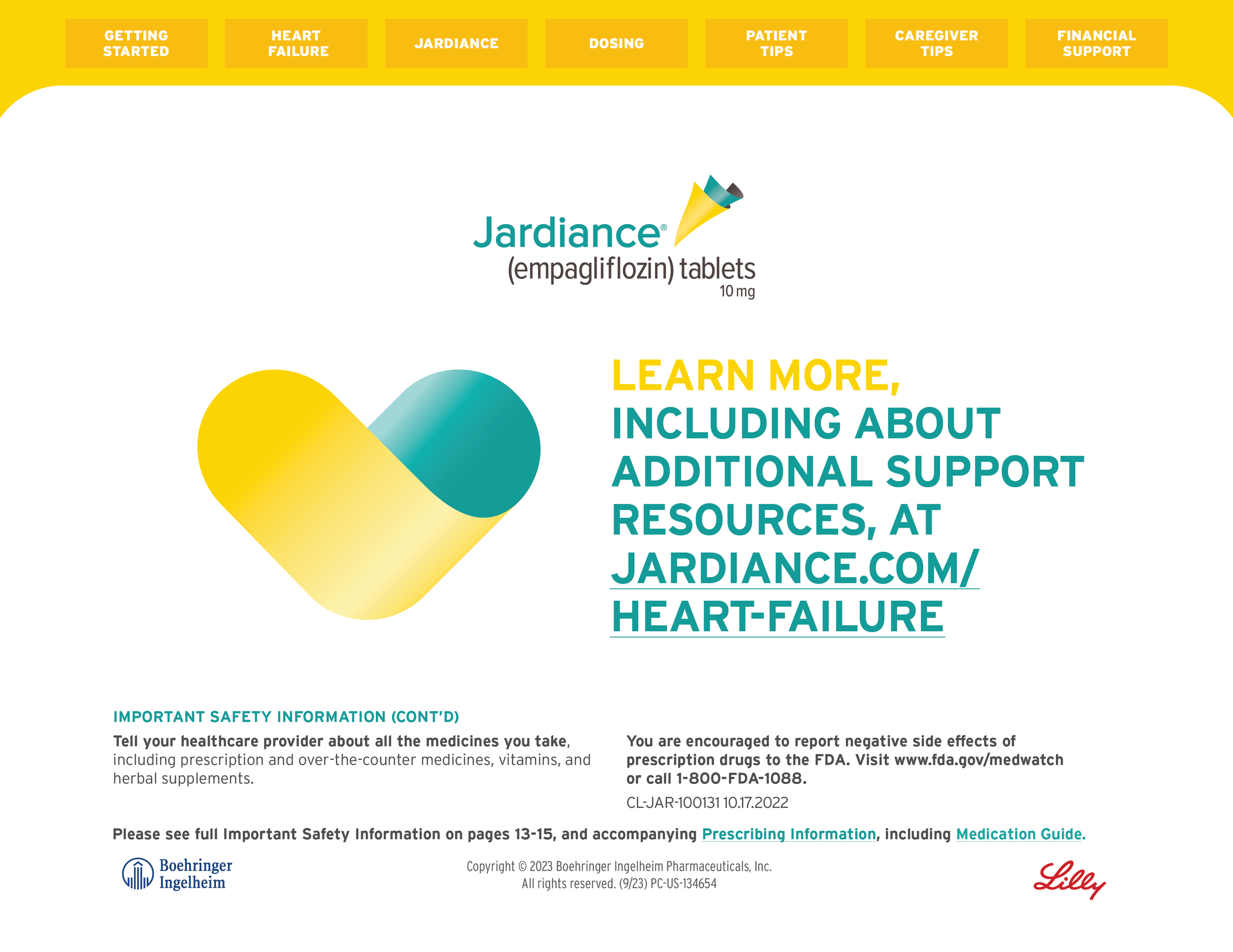
For this project, I transformed a print piece into an interactive digital education tool for medical professionals like nurse practitioners and physician assistants. This patient-facing resource educates about Jardiance, leveraging the existing content while adapting its format and adding new functionalities. To enhance user experience, I incorporated a navigation bar for easy access to key information.
The final PDF is fully interactive and can tested here.
Savings Cards
In addition to the projects above, I also played a key role in designing and refreshing savings cards and their accompanying packaging. These materials, intended for doctor's offices, aimed to clearly communicate crucial information while adhering to FDA regulations. I ensured designs aligned with the latest marketing campaigns while maintaining clarity and ease of understanding. This project required balancing creativity with regulatory compliance, as showcased in the visual schematic presented for FDA review.
Print Brochures
At Boehringer Ingelheim, we were assigned a variety of print projects for pharma reps ranging from patient brochures, savings cards, tear pads, dosing guides and more. Below is an example of a print brochure for Jardiance with branding and imagery from corresponding television campaign.
Digital Banner Ads
As a Visual Designer, I played a key role in adapting existing marketing campaigns into compelling digital banner ads. This task involved understanding the core message and target audience of each campaign, then translating those elements into concise visuals and impactful messaging suitable for the specific constraints of digital banner formats. Below are some examples of those ads approved for 2024.


